Tenbrugge

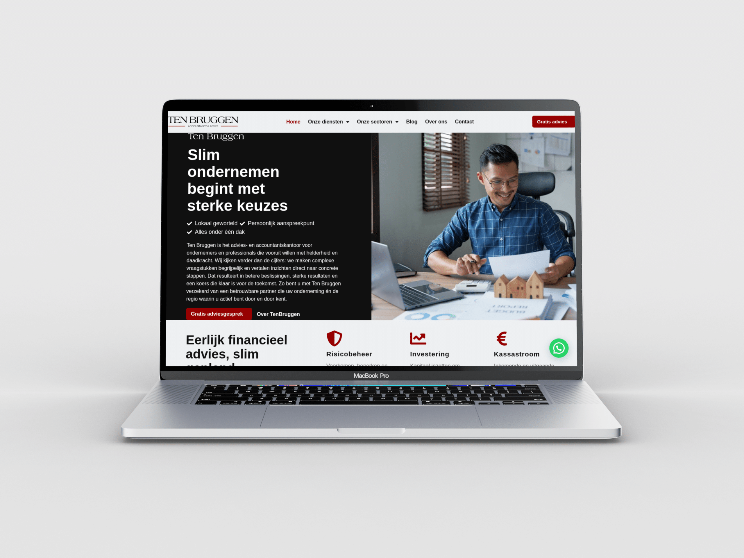
For Ten Bruggen, I built a WordPress website with clear navigation and streamlined client journeys; visit TenBruggen.nl to explore their official website.

Created in collaboration with Webactueel

4

Service Routes

Online

Appointment Booking

Plain-language

Financial Navigation

Mobile-first

Service Journey

Problem

Tenbrugge needed a website that could make several financial services understandable without forcing visitors to learn accounting language first. Business owners and private clients may arrive with very different questions about administration, tax, payroll or financial guidance, so the main challenge was choosing a clear route before asking for contact.

The old portfolio wording described this too broadly and followed the same pattern as unrelated projects. For this case, the problem is more specific: visitors need to recognise their situation, see which service is relevant and understand what information comes next. The page structure also has to stay calm on mobile, where long explanations quickly become hard to scan. The case study should explain that decision clearly without inventing financial results or client outcomes.

Solution

I shaped the Tenbrugge WordPress site around the questions people bring to a financial adviser rather than around a long list of services. Accountancy, tax, payroll and wider financial guidance are separated into clear routes, with supporting information placed after the first choice instead of before it.

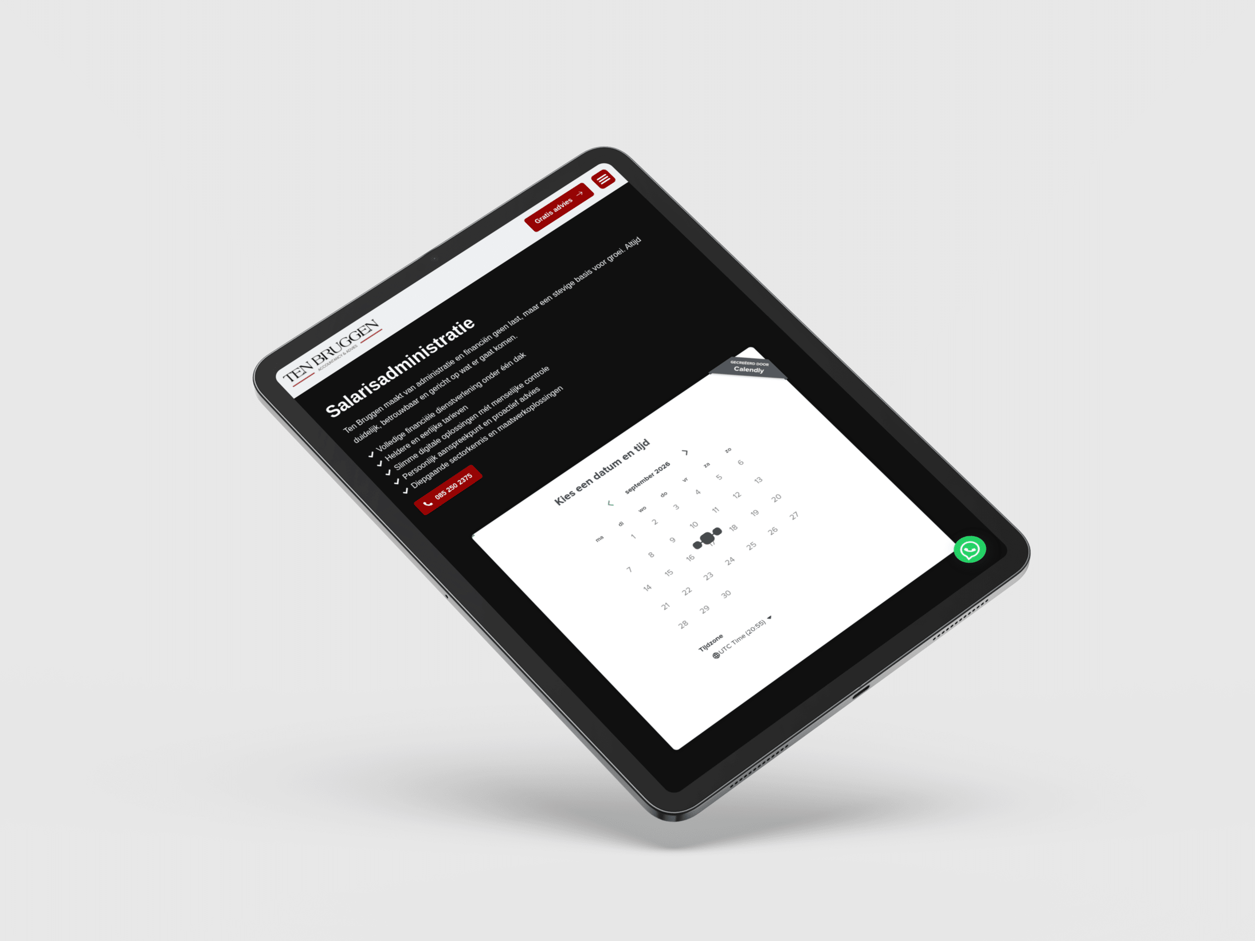
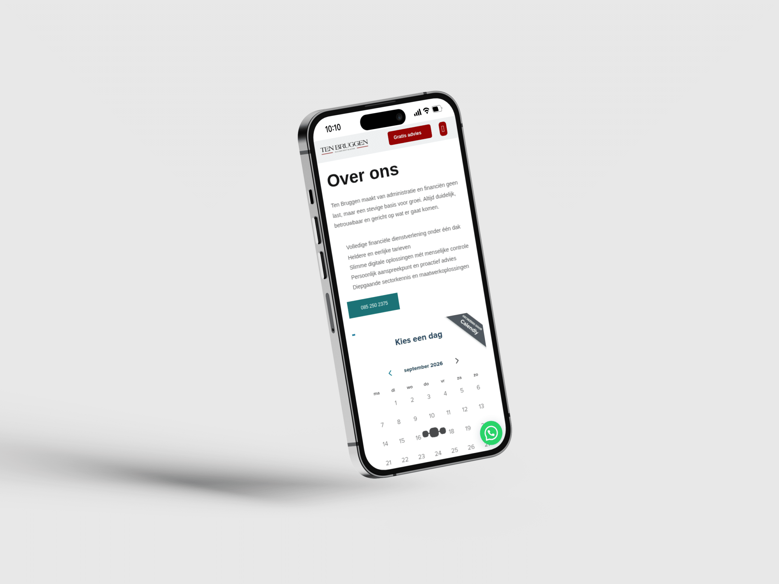
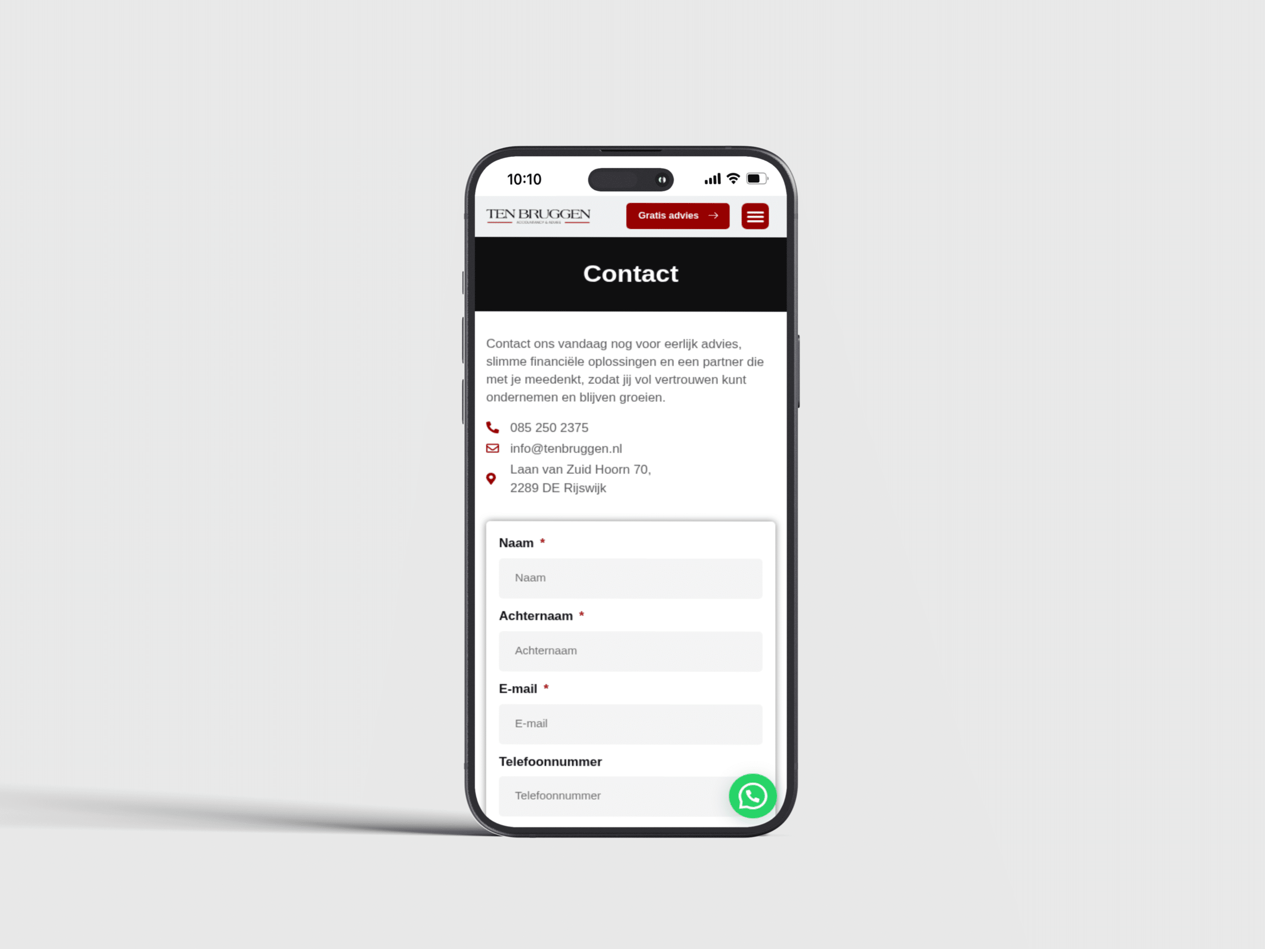
Contact and appointment actions remain visible when a visitor has enough context to continue. I kept the language plain and the sections short so someone can understand the offer without specialist knowledge. On smaller screens, service choices and next steps keep the same order. The portfolio story now focuses on the actual information problem and how the site solves it, instead of using generic claims about better design, stronger conversion or business growth that were never measured.